Tables, hierarchies and flows
Detailed records, expandable tables, paths, relationships and narrative facts.
Open Add widget and choose the exact tile name below. Standard tiles use a base renderer. Specialized widget tiles preload that renderer’s specialized view, field mappings and starter data. Both are editable in Studio. Read the shared data, styling and interaction guide before replacing starter data.
Screenshots. These are real Studio widgets with fictional sample data and example settings. Colors, labels and layout remain configurable. Select an image to view it at full size.
Table
Standard · Picker tile table
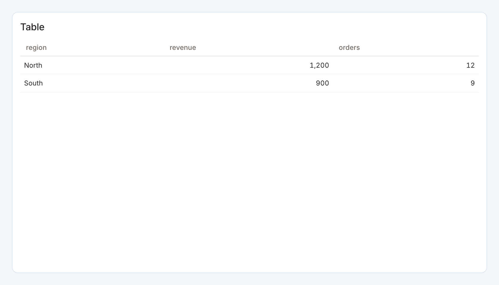
Required data and grain. One row per record or summary. All returned columns can be displayed. There is no fixed column count.
| Example field | Type | Role in this example |
|---|---|---|
region | Text | Required |
revenue | Number | Required |
orders | Number | Optional / available to map |
Optional fields and bindings. Include stable keys for actions. Optional precomputed numerator and denominator fields can support ratio totals.
Example result.
region | revenue | orders |
|---|---|---|
North | 1200 | 12 |
South | 900 | 9 |
Download the complete data example. Select this tile to load its preset settings, then use these column names in the visual builder or the example query.
Styling controls. Table controls set visible columns, names, widths, alignment, number formats, fonts, header and body colors, row bands, borders, totals, search and pagination.
Interactions. Sort columns, search and move between pages. Configure a row action for filtering or drill-through and keep its key in the result even if it is hidden.
Check before publishing. Totals must match the business meaning. Sum additive measures and compute a rate from aggregate numerator and denominator, rather than adding percentages.
Sankey
Standard · Picker tile sankey
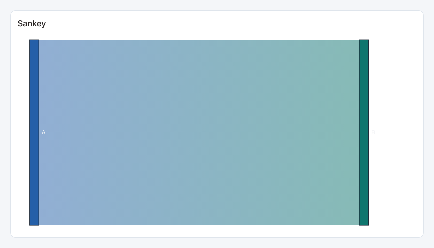
Required data and grain. One row per directed link. Columns are source node, target node and numeric flow value.
| Example field | Type | Role in this example |
|---|---|---|
src | Text | Required |
dst | Text | Required |
value | Number | Required |
Optional fields and bindings. Use consistent node labels and aggregate duplicate links. Values should be nonnegative.
Example result.
src | dst | value |
|---|---|---|
A | B | 100 |
Download the complete data example. Select this tile to load its preset settings, then use these column names in the visual builder or the example query.
Styling controls. Set palette, labels and legend. Increase width for additional stages and height for more nodes.
Interactions. Hover for values where a tooltip is shown. This renderer does not send mark selections to dashboard filters or drill-through.
Check before publishing. Use Selectable flow or Multi-stage flow for configured selection and stage-building controls.
Treemap
Standard · Picker tile treemap
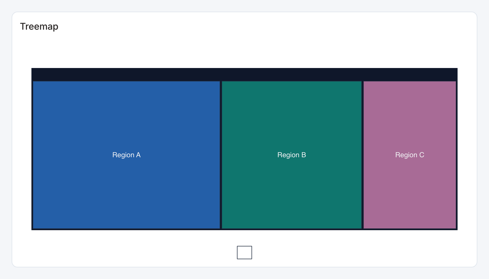
Required data and grain. For a flat treemap use label and numeric value. For a grouped treemap use parent, leaf label and numeric value.
| Example field | Type | Role in this example |
|---|---|---|
label | Text | Required |
value | Number | Required |
Optional fields and bindings. The third-column form adds one parent level. Aggregate repeated paths.
Example result.
label | value |
|---|---|
Region A | 1200 |
Region B | 900 |
Region C | 600 |
Download the complete data example. Select this tile to load its preset settings, then use these column names in the visual builder or the example query.
Styling controls. Set category colors, labels, legend and number format. Reserve enough area for the smallest leaves.
Interactions. Marks can send the selected category to a configured filter or drill-through action in view and presentation modes. Test the receiving widget with the same category and filter name.
Check before publishing. Use Hierarchy treemap for deeper paths and a configurable selection level.
Sunburst
Standard · Picker tile sunburst
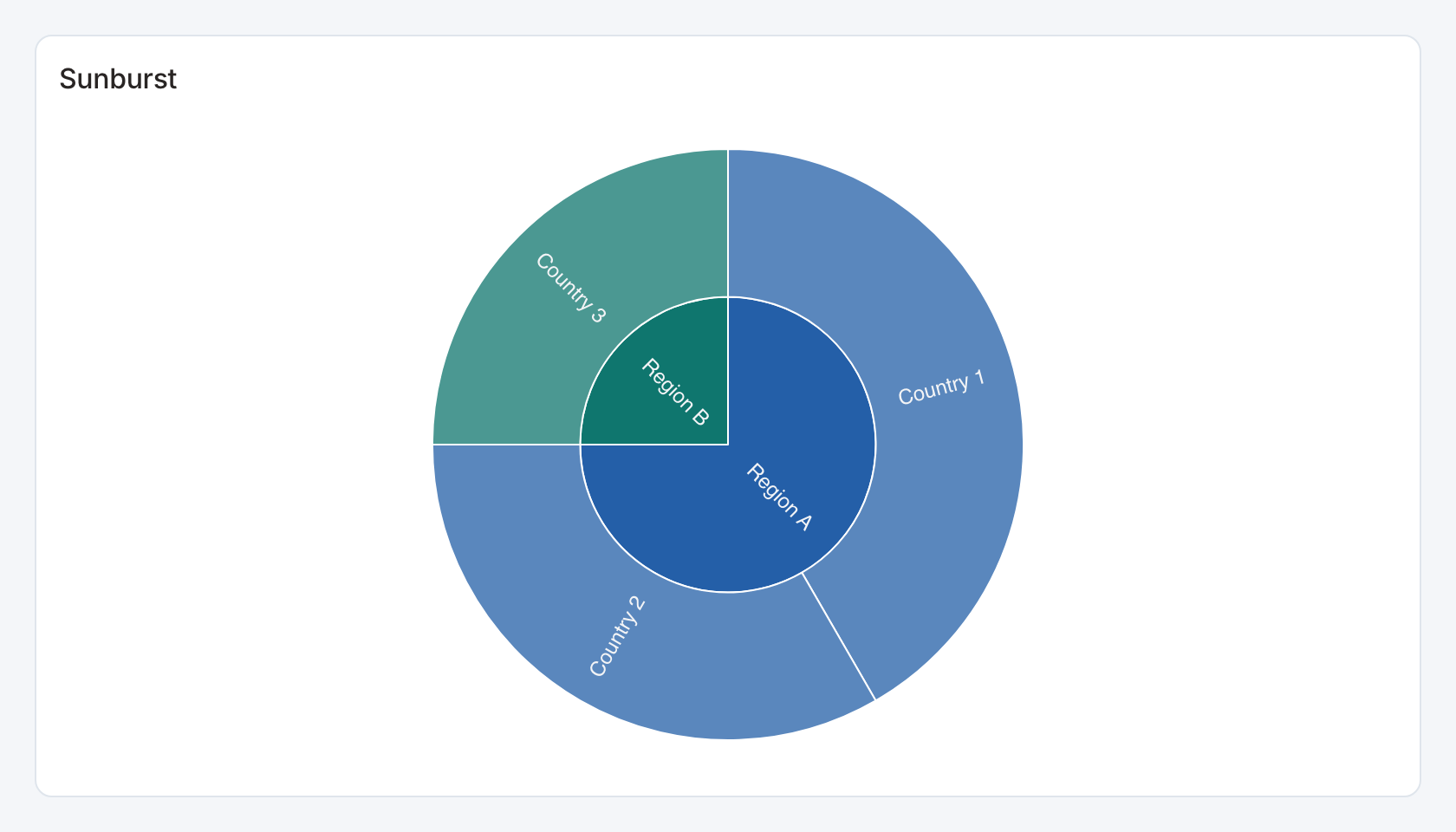
Required data and grain. One row per parent/child pair. Columns are parent label, child label and numeric value.
| Example field | Type | Role in this example |
|---|---|---|
parent | Text | Required |
child | Text | Required |
value | Number | Required |
Optional fields and bindings. Aggregate repeated paths and use nonnegative magnitudes.
Example result.
parent | child | value |
|---|---|---|
Region A | Country 1 | 100 |
Region A | Country 2 | 80 |
Region B | Country 3 | 60 |
Download the complete data example. Select this tile to load its preset settings, then use these column names in the visual builder or the example query.
Styling controls. Set palette, labels and legend. Size the card so inner and outer rings are readable.
Interactions. Marks can send the selected category to a configured filter or drill-through action in view and presentation modes. Test the receiving widget with the same category and filter name.
Check before publishing. Use Hierarchy ring for more than two hierarchy levels and an explicit selection level.
Graph
Standard · Picker tile graph
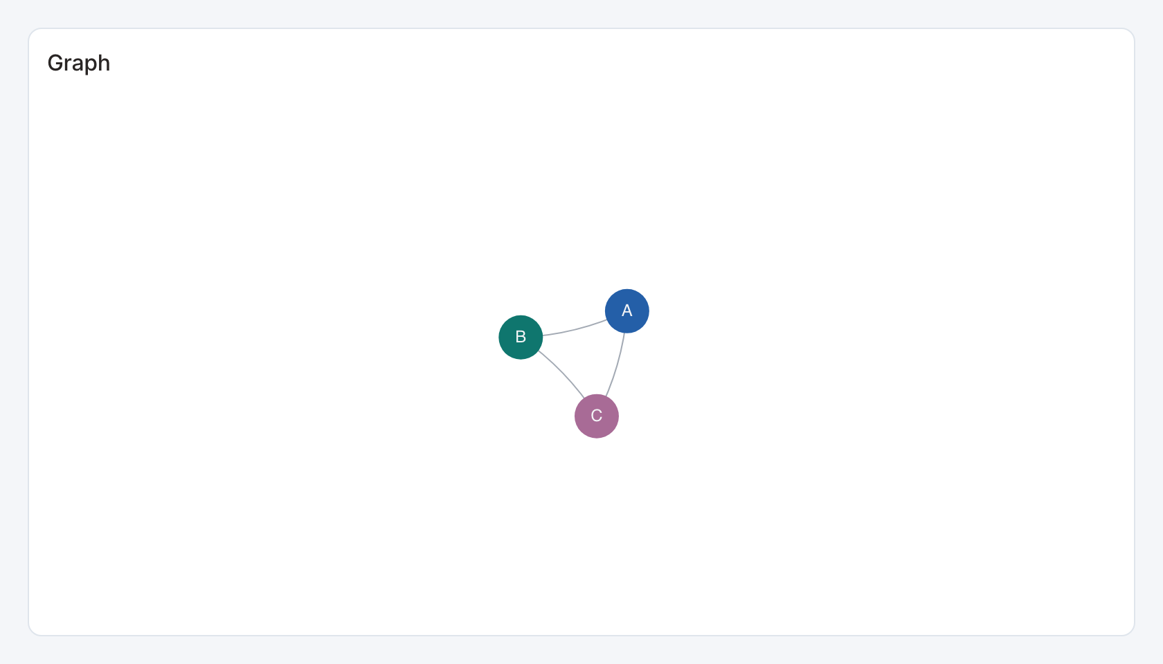
Required data and grain. One row per edge. The first two columns are source and target labels.
| Example field | Type | Role in this example |
|---|---|---|
source | Text | Required |
target | Text | Required |
value | Number | Optional / available to map |
Optional fields and bindings. An optional third numeric column supplies edge value. Nodes are derived from link endpoints.
Example result.
source | target | value |
|---|---|---|
A | B | 5 |
B | C | 3 |
A | C | 2 |
Download the complete data example. Select this tile to load its preset settings, then use these column names in the visual builder or the example query.
Styling controls. Set palette, labels and legend. Give the force layout enough canvas space.
Interactions. Hover for values where a tooltip is shown. This renderer does not send mark selections to dashboard filters or drill-through.
Check before publishing. This view is a relationship graph. Do not interpret screen distance as a geographic or measured distance.
Tree
Standard · Picker tile tree
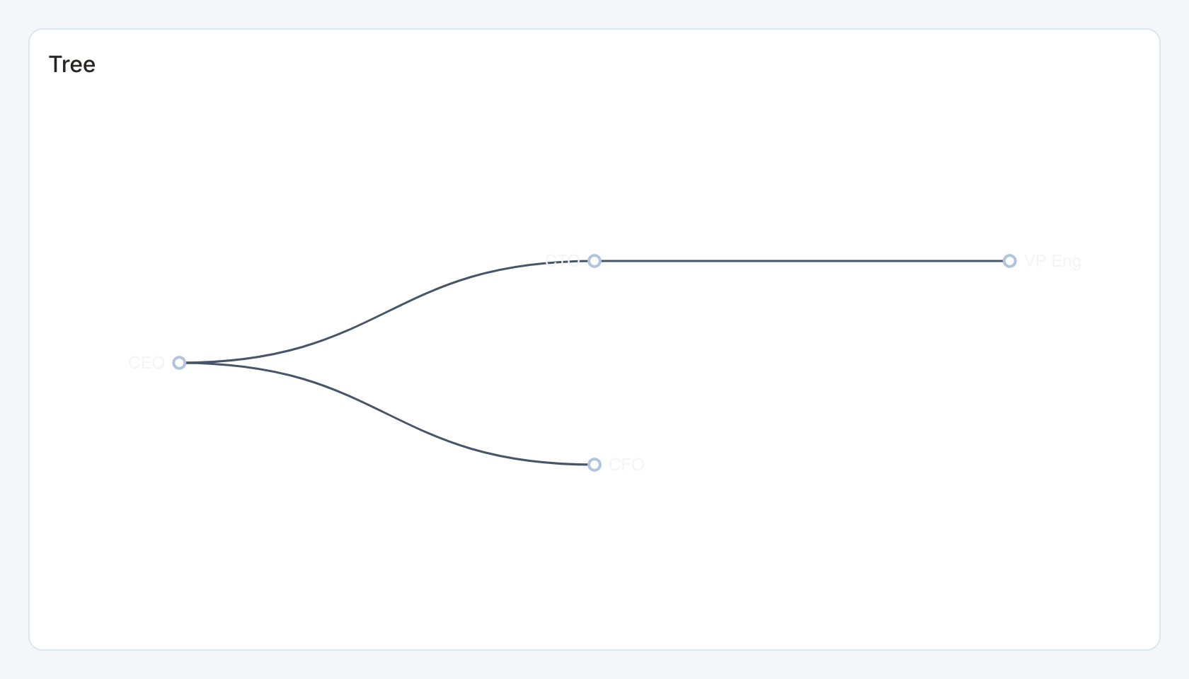
Required data and grain. One row per parent/child relationship. The first two columns supply the labels.
| Example field | Type | Role in this example |
|---|---|---|
parent | Text | Required |
child | Text | Required |
Optional fields and bindings. An optional third numeric column supplies value. Keep parent/child relationships acyclic.
Example result.
parent | child |
|---|---|
CEO | CTO |
CEO | CFO |
CTO | VP Eng |
Download the complete data example. Select this tile to load its preset settings, then use these column names in the visual builder or the example query.
Styling controls. Set palette and labels and increase width or height for deep or wide trees.
Interactions. Use the tree’s local expand/collapse behavior where shown. This renderer does not send node selections to dashboard filters.
Check before publishing. Use Expandable hierarchy for a tabular hierarchy with explicit linked selections and totals.
Insight cards
Specialized widget · Picker tile insight-cards
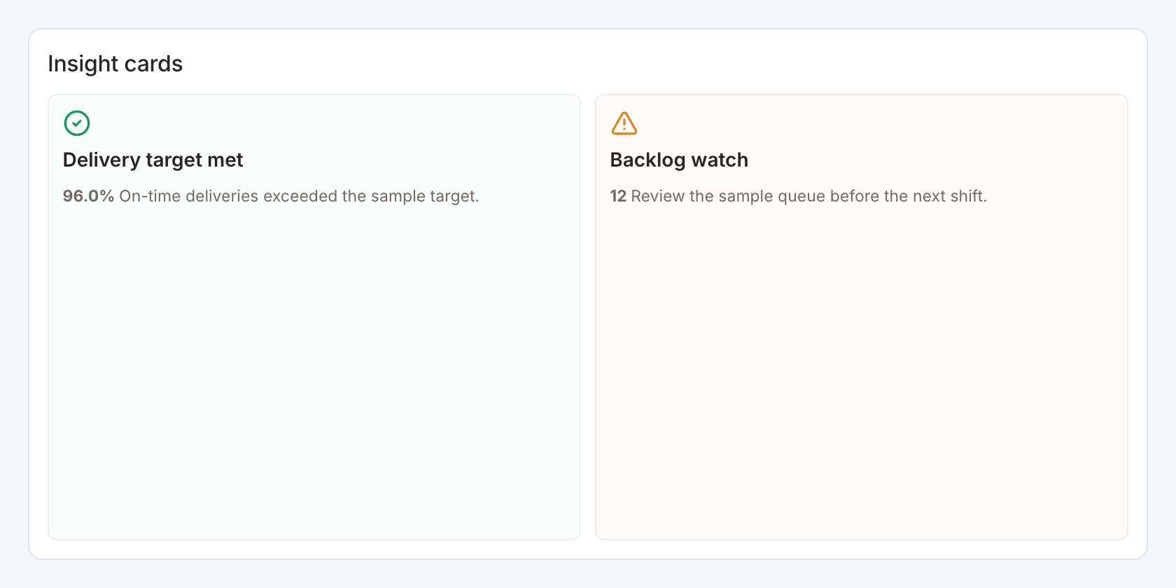
Required data and grain. One row per authored insight with a title and message.
| Example field | Type | Role in this example |
|---|---|---|
title | Text | Required |
message | Text | Required |
severity | Text | Optional / available to map |
value | Number | Optional / available to map |
format | Text | Optional / available to map |
Optional fields and bindings. severity can classify success, warning or other states. Optional value and format fields add a formatted number.
Example result.
title | message | severity | value | format |
|---|---|---|---|---|
Delivery target met | On-time deliveries exceeded the sample target. | success | 0.96 | percent |
Backlog watch | Review the sample queue before the next shift. | warning | 12 | number |
Download the complete data example. Select this tile to load its preset settings, then use these column names in the visual builder or the example query.
Styling controls. Insight controls choose cards layout, severity colors, title/message styling, value format and panel/frame appearance.
Interactions. Configured titles can send a selection to a dashboard action. Messages themselves are display content.
Check before publishing. These panels display supplied text and values. The tile does not generate explanations or detect business conditions on its own.
Insight callout
Specialized widget · Picker tile insight-callout
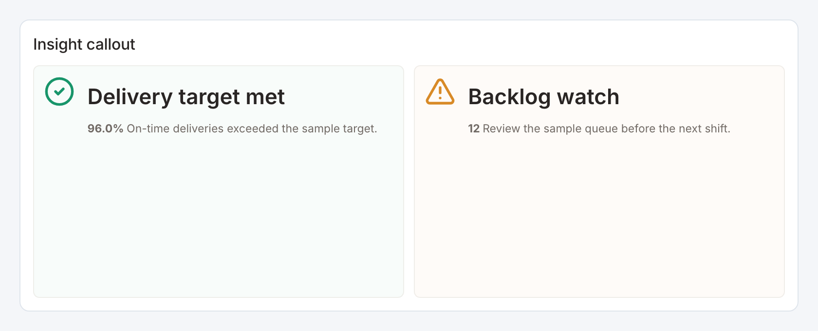
Required data and grain. One row per authored insight with a title and message.
| Example field | Type | Role in this example |
|---|---|---|
title | Text | Required |
message | Text | Required |
severity | Text | Optional / available to map |
value | Number | Optional / available to map |
format | Text | Optional / available to map |
Optional fields and bindings. severity can classify success, warning or other states. Optional value and format fields add a formatted number.
Example result.
title | message | severity | value | format |
|---|---|---|---|---|
Delivery target met | On-time deliveries exceeded the sample target. | success | 0.96 | percent |
Backlog watch | Review the sample queue before the next shift. | warning | 12 | number |
Download the complete data example. Select this tile to load its preset settings, then use these column names in the visual builder or the example query.
Styling controls. Insight controls choose callout layout, severity colors, title/message styling, value format and panel/frame appearance.
Interactions. Configured titles can send a selection to a dashboard action. Messages themselves are display content.
Check before publishing. These panels display supplied text and values. The tile does not generate explanations or detect business conditions on its own.
Asset profile
Specialized widget · Picker tile asset-profile
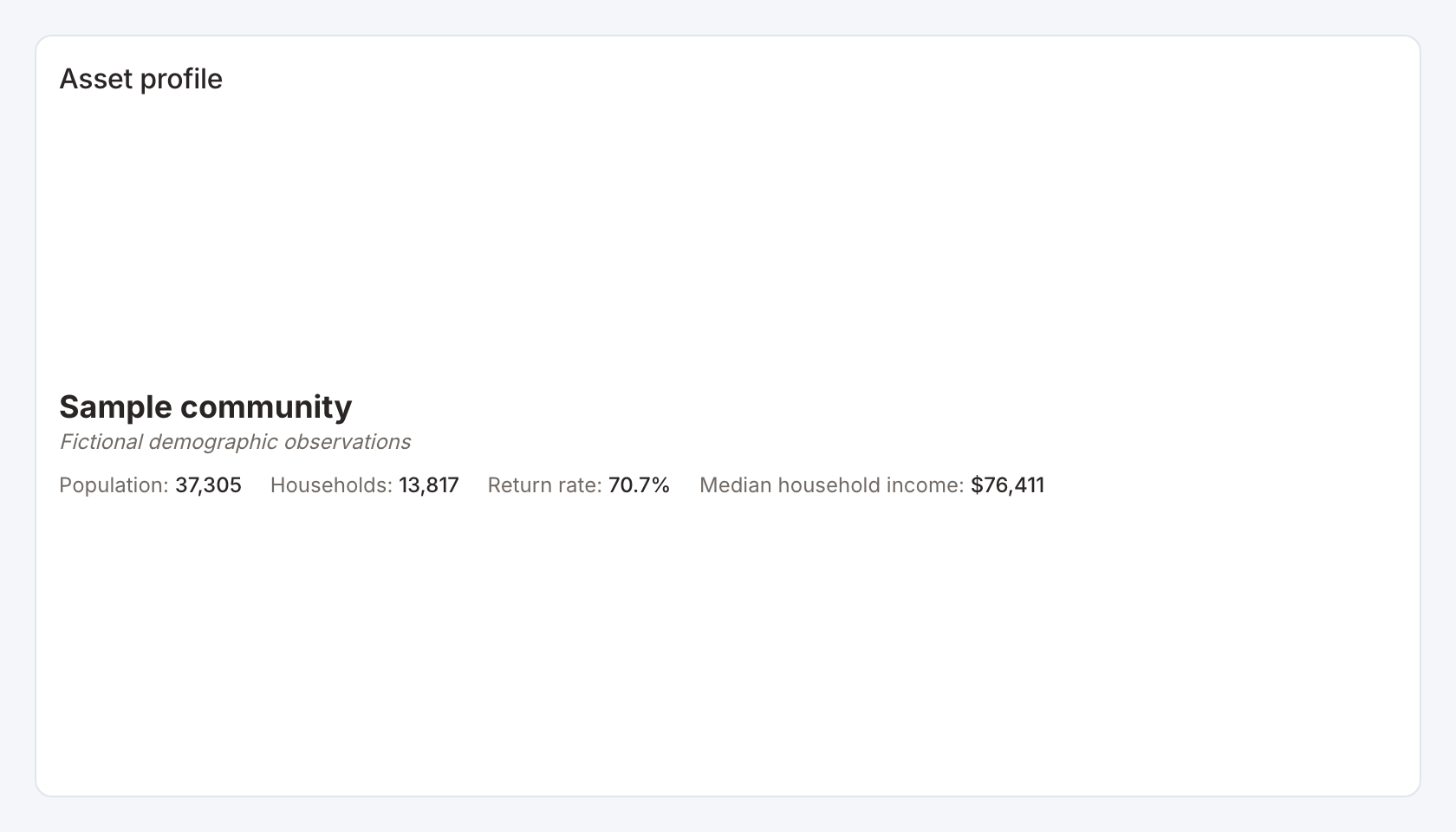
Required data and grain. A profile row with a name and numeric fields listed in the profile configuration.
| Example field | Type | Role in this example |
|---|---|---|
name | Text | Required |
subtitle | Text | Optional / available to map |
population | Number | Required |
households | Number | Required |
return_rate | Number | Required |
median_income | Number | Required |
Optional fields and bindings. subtitle is optional. Replace the starter fields with your own labeled numeric or text facts.
Example result.
name | subtitle | population | households | return_rate | median_income |
|---|---|---|---|---|---|
Sample community | Fictional demographic observations | 37305 | 13817 | 0.7074 | 76411 |
Download the complete data example. Select this tile to load its preset settings, then use these column names in the visual builder or the example query.
Styling controls. Choose inline layout, field order, labels, per-field formats, typography and band color for facts.
Interactions. This view displays the selected profile result. Use an upstream filter to choose the entity. It does not emit profile-field selections.
Check before publishing. The starter is fictional demographic data. Percent fields such as return_rate use fractions and currency fields need the correct currency code.
Banded facts
Specialized widget · Picker tile community-facts
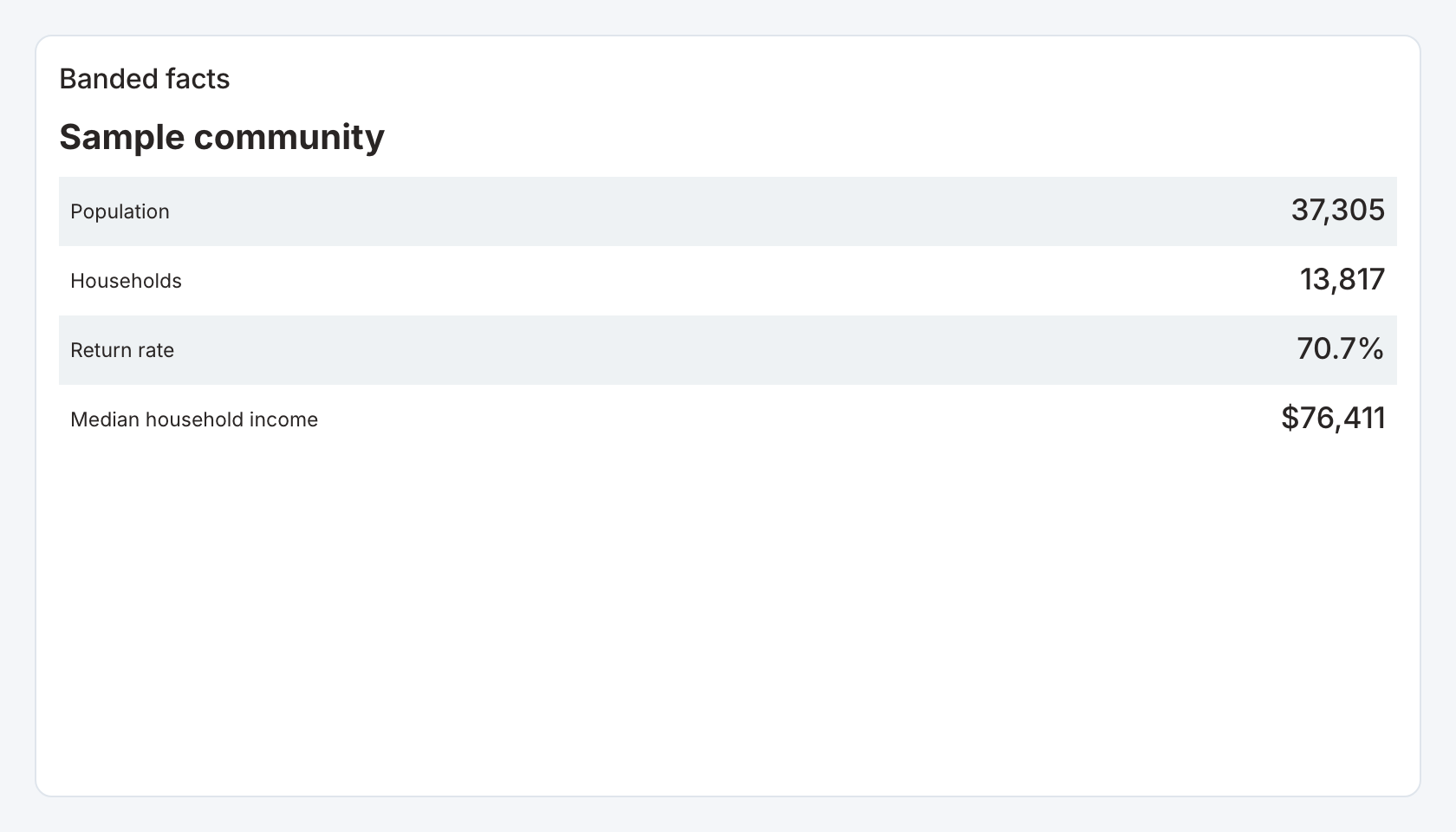
Required data and grain. A profile row with a name and numeric fields listed in the profile configuration.
| Example field | Type | Role in this example |
|---|---|---|
name | Text | Required |
subtitle | Text | Optional / available to map |
population | Number | Required |
households | Number | Required |
return_rate | Number | Required |
median_income | Number | Required |
Optional fields and bindings. subtitle is optional. Replace the starter fields with your own labeled numeric or text facts.
Example result.
name | subtitle | population | households | return_rate | median_income |
|---|---|---|---|---|---|
Sample community | Fictional demographic observations | 37305 | 13817 | 0.7074 | 76411 |
Download the complete data example. Select this tile to load its preset settings, then use these column names in the visual builder or the example query.
Styling controls. Choose facts layout, field order, labels, per-field formats, typography and band color for facts.
Interactions. This view displays the selected profile result. Use an upstream filter to choose the entity. It does not emit profile-field selections.
Check before publishing. The starter is fictional demographic data. Percent fields such as return_rate use fractions and currency fields need the correct currency code.
Multi-stage flow
Specialized widget · Picker tile staged-flow
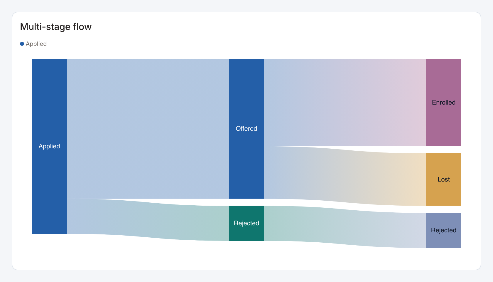
Required data and grain. One row per outcome or path with a numeric weight. Each configured stage is a literal label or a source column.
| Example field | Type | Role in this example |
|---|---|---|
status | Text | Required |
value | Number | Required |
Optional fields and bindings. Value-label mappings can merge raw statuses into a shared intermediate stage.
Example result.
status | value |
|---|---|
Enrolled | 50 |
Lost | 30 |
Rejected | 20 |
Download the complete data example. Select this tile to load its preset settings, then use these column names in the visual builder or the example query.
Styling controls. Flow controls define ordered stages, literal or field-derived nodes, value mappings, node width, gap, labels, order and colors.
Interactions. Select a configured node side or stage to send its mapped value to an action.
Check before publishing. The starter maps Enrolled and Lost to Offered at the middle stage, while preserving their separate final outcomes. Check totals after grouping paths.
Selectable flow
Specialized widget · Picker tile selectable-flow
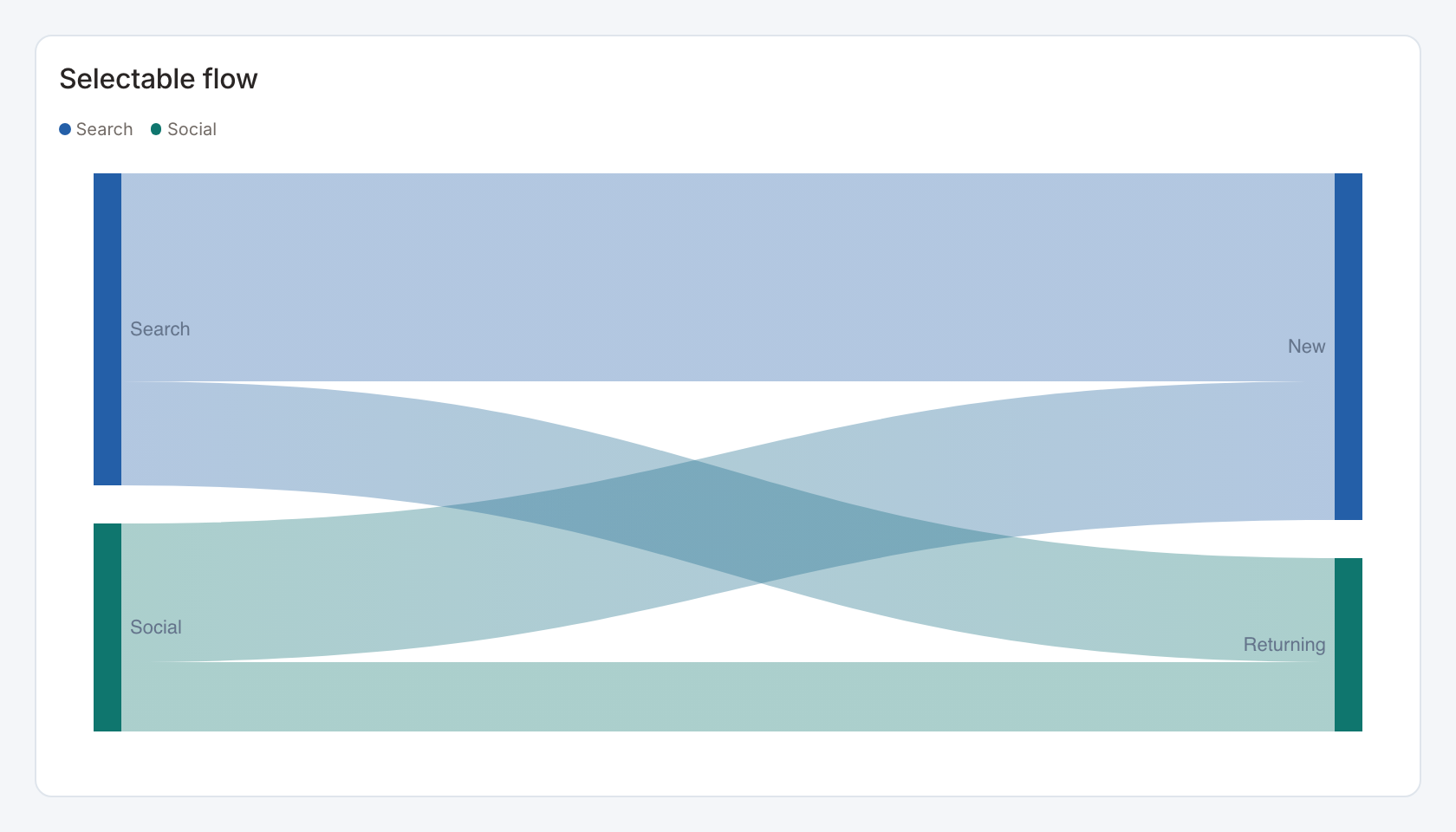
Required data and grain. One row per weighted source/target link.
| Example field | Type | Role in this example |
|---|---|---|
source | Text | Required |
target | Text | Required |
value | Number | Required |
Optional fields and bindings. Use stable categories for selection and aggregate duplicate links.
Example result — first three rows.
source | target | value |
|---|---|---|
Search | New | 120 |
Social | New | 80 |
Search | Returning | 60 |
Download the complete data example. Select this tile to load its preset settings, then use these column names in the visual builder or the example query.
Styling controls. Set source/target/value bindings, selection side, node width/gap, label position, ordering and palette.
Interactions. Select the configured source or target side to filter or drill through.
Check before publishing. All flow values must have the same unit. Avoid using the same ambiguous label for unrelated nodes.
Hierarchy ring
Specialized widget · Picker tile hierarchy-ring
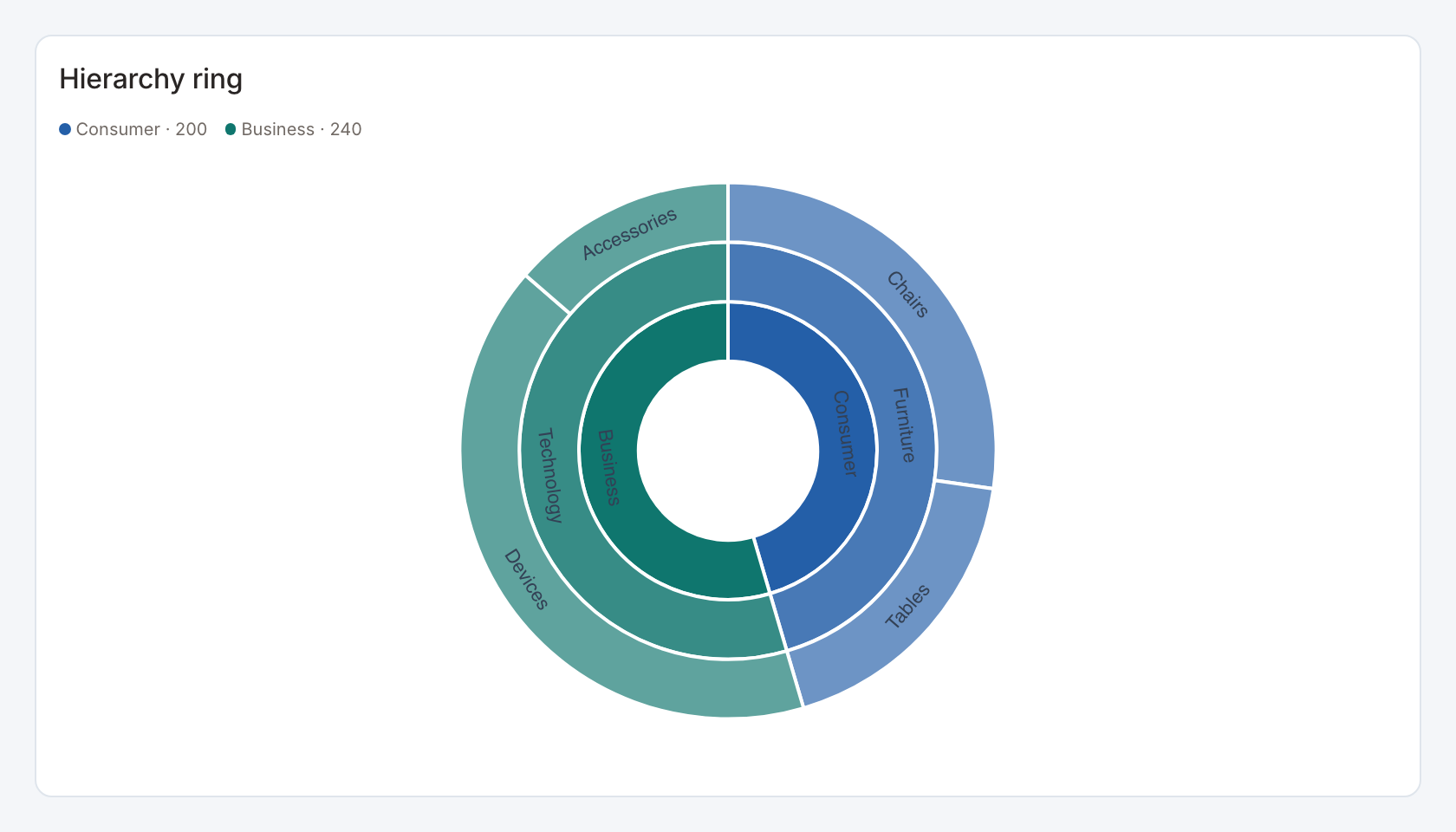
Required data and grain. One row per hierarchy path, with ordered hierarchy columns and a numeric leaf value.
| Example field | Type | Role in this example |
|---|---|---|
division | Text | Required |
category | Text | Required |
item | Text | Required |
id | Text | Optional / available to map |
value | Number | Required |
cost | Number | Optional / available to map |
Optional fields and bindings. id is an optional stable leaf selection key. cost is extra sample data unless mapped.
Example result — first three rows.
division | category | item | id | value | cost |
|---|---|---|---|---|---|
Consumer | Furniture | Chairs | A | 120 | 75 |
Consumer | Furniture | Tables | B | 80 | 50 |
Business | Technology | Devices | C | 180 | 100 |
Download the complete data example. Select this tile to load its preset settings, then use these column names in the visual builder or the example query.
Styling controls. Choose sunburst layout, hierarchy levels, value binding, selection level, labels, palette and number format.
Interactions. Select the configured hierarchy level for a linked action. Treemap local zoom is available when linked mark selection is not handling the click.
Check before publishing. Aggregate duplicate paths and reconcile parent totals. Changing the selection level changes which field value a click sends.
Hierarchy treemap
Specialized widget · Picker tile hierarchy-map
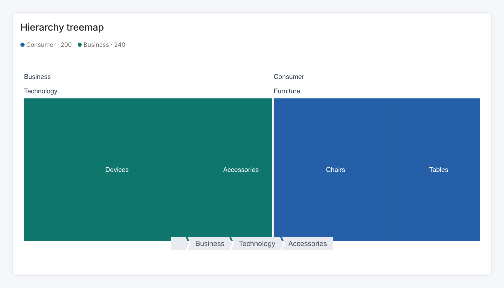
Required data and grain. One row per hierarchy path, with ordered hierarchy columns and a numeric leaf value.
| Example field | Type | Role in this example |
|---|---|---|
division | Text | Required |
category | Text | Required |
item | Text | Required |
id | Text | Optional / available to map |
value | Number | Required |
cost | Number | Optional / available to map |
Optional fields and bindings. id is an optional stable leaf selection key. cost is extra sample data unless mapped.
Example result — first three rows.
division | category | item | id | value | cost |
|---|---|---|---|---|---|
Consumer | Furniture | Chairs | A | 120 | 75 |
Consumer | Furniture | Tables | B | 80 | 50 |
Business | Technology | Devices | C | 180 | 100 |
Download the complete data example. Select this tile to load its preset settings, then use these column names in the visual builder or the example query.
Styling controls. Choose treemap layout, hierarchy levels, value binding, selection level, labels, palette and number format.
Interactions. Select the configured hierarchy level for a linked action. Treemap local zoom is available when linked mark selection is not handling the click.
Check before publishing. Aggregate duplicate paths and reconcile parent totals. Changing the selection level changes which field value a click sends.
Expandable hierarchy
Specialized widget · Picker tile hierarchy-detail
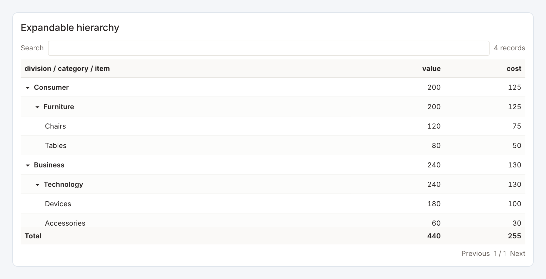
Required data and grain. One row per hierarchy leaf, with ordered levels, a stable selection key and numeric measures.
| Example field | Type | Role in this example |
|---|---|---|
division | Text | Required |
category | Text | Required |
item | Text | Required |
id | Text | Required |
value | Number | Required |
cost | Number | Required |
Optional fields and bindings. Add more numeric measure columns and configure ratio totals where appropriate.
Example result — first three rows.
division | category | item | id | value | cost |
|---|---|---|---|---|---|
Consumer | Furniture | Chairs | A | 120 | 75 |
Consumer | Furniture | Tables | B | 80 | 50 |
Business | Technology | Devices | C | 180 | 100 |
Download the complete data example. Select this tile to load its preset settings, then use these column names in the visual builder or the example query.
Styling controls. Table controls set hierarchy levels, measures, initial expansion, totals, search, formats, fonts, widths, borders and row/header colors.
Interactions. Expand/collapse levels, search and select a leaf through its configured key for a linked action.
Check before publishing. Choose aggregate logic deliberately. Adding leaf percentages produces a misleading parent total.
Period hierarchy table
Specialized widget · Picker tile period-hierarchy
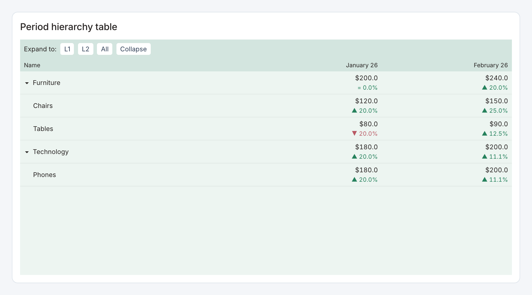
Required data and grain. One row per period and hierarchy leaf, with actual and optional previous value.
| Example field | Type | Role in this example |
|---|---|---|
period | ISO date text | Required |
category | Text | Required |
item | Text | Required |
value | Number | Required |
previous | Number | Optional / available to map |
Optional fields and bindings. previous supports comparison/change columns. The starter selects item as its action field.
Example result — first three rows.
period | category | item | value | previous |
|---|---|---|---|---|
2026-01-01 | Furniture | Chairs | 120 | 100 |
2026-02-01 | Furniture | Chairs | 150 | 120 |
2026-01-01 | Furniture | Tables | 80 | 100 |
Download the complete data example. Select this tile to load its preset settings, then use these column names in the visual builder or the example query.
Styling controls. Period table controls choose date/period kind, labels, hierarchy levels, formats, change visibility, expansion controls, header/body colors and sizing.
Interactions. Expand/collapse hierarchy and inspect side-by-side periods. The starter disables automatic cross-filtering. Add an explicit action only after choosing a stable selection field.
Check before publishing. Repeated leaf names under different parents need a stable distinct key if they should filter independently.
Weather cards
Specialized widget · Picker tile weather-cards
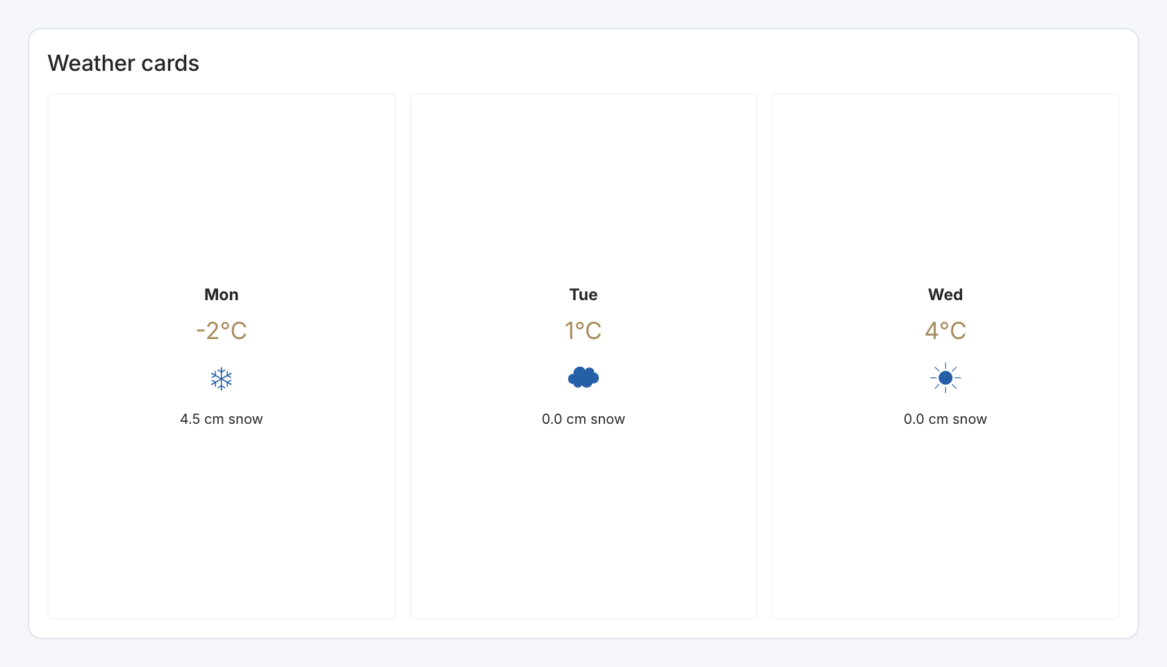
Required data and grain. One row per day, with numeric temperature and snow amount plus a condition label.
| Example field | Type | Role in this example |
|---|---|---|
day | Text | Required |
temperature | Number | Required |
snow | Number | Required |
condition | Text | Required |
Optional fields and bindings. Prepare the weather observations upstream.
Example result.
day | temperature | snow | condition |
|---|---|---|---|
Mon | -2 | 4.5 | Snow |
Tue | 1 | 0 | Cloudy |
Wed | 4 | 0 | Sunny |
Download the complete data example. Select this tile to load its preset settings, then use these column names in the visual builder or the example query.
Styling controls. Choose day, temperature, snow and condition mappings, labels, colors and card/frame styling.
Interactions. Select a day card to send its day label to a configured action. The cards display returned observations and do not fetch a live forecast.
Check before publishing. This renderer labels temperature in °C and snowfall in cm. Convert source values to those units upstream. A missing observation is different from zero snowfall.