Text and canvas controls
Text, logos, page navigation, filter panels and palette samples.
Open Add widget and choose the exact tile name below. Standard tiles use a base renderer. Specialized widget tiles preload that renderer’s specialized view, field mappings and starter data. Both are editable in Studio. Read the shared data, styling and interaction guide before replacing starter data.
Screenshots. These are real Studio widgets with fictional sample data and example settings. Colors, labels and layout remain configurable. Select an image to view it at full size.
Text
Standard · Picker tile text
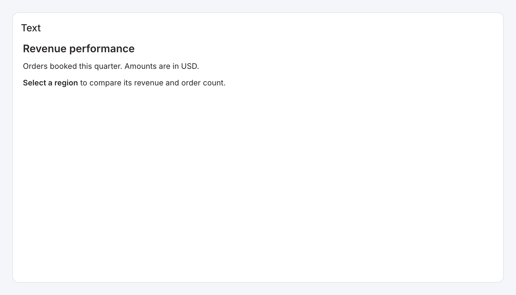
Required data and grain. No query is required. Enter the content directly in the text editor.
Example setup. Optional image, navigation, filter and palette panel modes are separate picker tiles on this page.
Example content.
## Revenue performance
Orders booked this quarter. Amounts are in USD.
**Select a region** to compare its revenue and order count.
Styling controls. Use the Markdown editor and text controls for headings, lists, links, alignment, size, color, bold, italic and underline. Frame controls provide a transparent background, padding and border visibility.
Interactions. Links follow their configured destinations. A plain text panel does not emit data-mark selections.
Check before publishing. Use a meaningful heading level and descriptive link text. A transparent, borderless panel takes its background from the page.
Logo panel
Specialized widget · Picker tile canvas-logo

The example uses a Gnok logo. Upload your own logo in the widget editor.
Required data and grain. No query. Supply an image in the Logo panel controls.
Example setup. Upload your own logo or enter an allowed image URL. Provide alternate text.
Example. Upload company-logo.png, set alternative text to Company name, choose Contain and use a transparent, borderless frame.
Styling controls. Choose contain or cover fit, image position, frame transparency, border and padding. Contain keeps the full logo visible.
Interactions. The panel displays the image. It does not emit data filters.
Check before publishing. An upload is saved with the dashboard image configuration. An external URL remains subject to the deployment image policy.
Canvas navigation
Specialized widget · Picker tile canvas-navigation
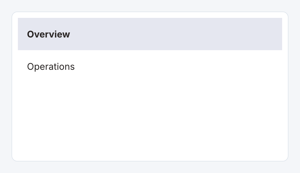
Required data and grain. No query. Add navigation items in the navigation panel controls.
Example setup. Each item needs a label and a destination page. Optional icons distinguish destinations.
Example. Add Overview and Operations items, bind each to the corresponding workbook page, and use a vertical layout in a left-side panel.
Styling controls. Choose horizontal or vertical layout, active background and text styling, plus the surrounding frame.
Interactions. Selecting an item navigates to its configured workbook page and marks the active item.
Check before publishing. A visible navigation item does not grant access to a page or its data. Test navigation after publishing.
Canvas filters
Specialized widget · Picker tile canvas-filters
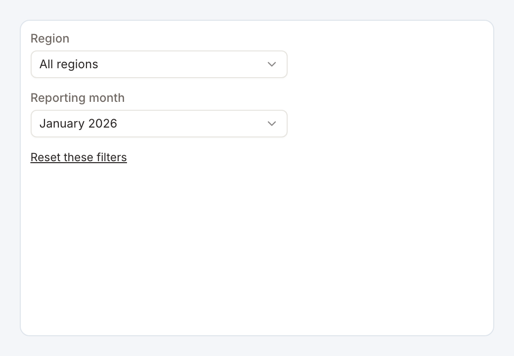
Required data and grain. No query of its own. Configure the workbook or page filters that the panel should display.
Example setup. Receiving widgets must bind to those filters. Give filters clear labels and usable defaults.
Example. Display a region dropdown with an All default and a reporting_month control. Bind both names to receiving widget conditions and enable reset.
Styling controls. Choose orientation, displayed filters and reset visibility. Style the surrounding panel and frame.
Interactions. Users change filter values and can reset them when the reset control is shown.
Check before publishing. Use the canvas panel or the standard filter placement deliberately. Showing the same filters in both places creates duplicate controls.
Color palette samples
Specialized widget · Picker tile palette-samples
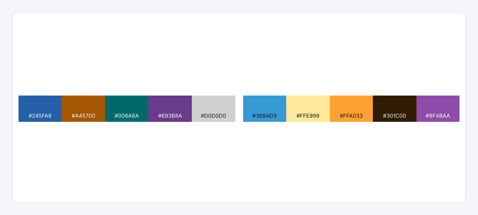
Required data and grain. No query. Define groups of color swatches in the palette controls.
Example setup. Each group can have a label and a list of colors.
Example. Add a group named Category colors with #245fa8, #a45700 and #006a6a. Show their codes so authors can reuse the same values in charts.
Styling controls. Set group columns, swatch height, labels and code visibility. The starter contains two sample color groups.
Interactions. Swatches communicate a palette. They do not apply a theme to other widgets or emit filters.
Check before publishing. Use this as a visible style guide and separately apply the chosen colors to charts or the dashboard theme.